
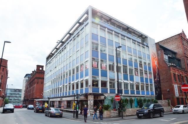
Designed by controversial architect Richard Seifert, Hilton House in Manchester's northern quarter had stood still, silently declining as the area flourished around it.
The big idea
The original vision was to simply dress up the elevations and remarket the space as low rent creative workspaces, but it was quickly apparent that Hilton House could so much more. So with CERT and Sheila Bird Studios we sought the solution to retain what was uniquely Hilton House and make it work well for a new audience; making it at home again in the 21st century commercial space.
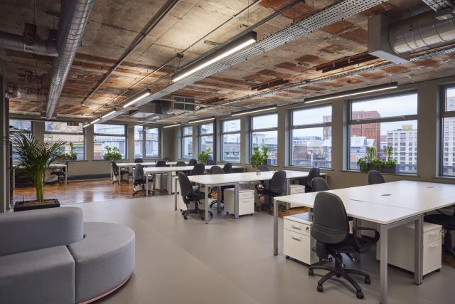
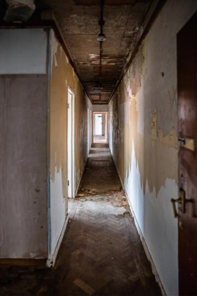
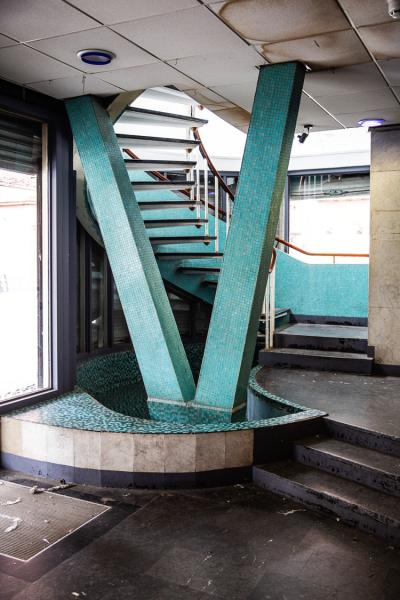
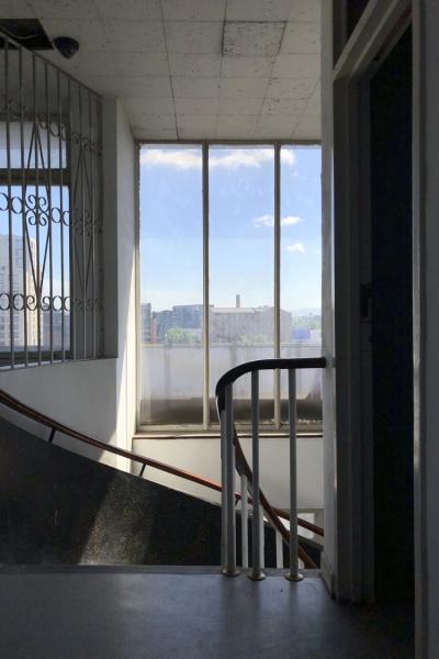
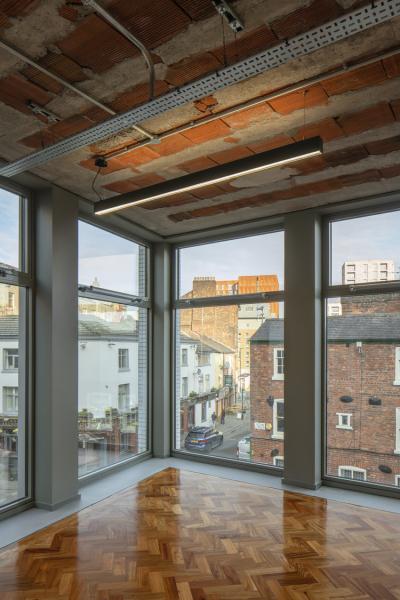
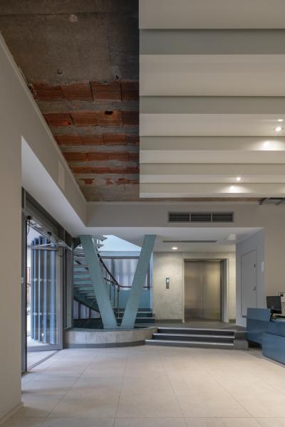
What was immediately apparent was the potential to create something special. There was parquet flooring hidden beneath the cheap and sticky carpet and a stunning spiral stair running the full height of the building. The bones of the building were good, we just needed to peel back the decades of additions and work with its original design detail again.
The strategy
Together with CERT we developed a strategy for the building. Hilton House would be capable of a single let, with the upper floors also being capable of being let floor by floor and as a last resort being multi-let. The ground floor would work best as a commercial retail space, ideally with an occupier that added value to the upper floors. No value was attributed to the basement car park, with a leisure use envisaged that again added value to the upper floors.
There was also opportunity to add space to the building, filling out the areas at the rear that stepped back like a wedding cake at the upper floors.
Design details
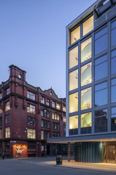
In developing the façade design, the team looked to Seifert’s work at the Centre Point in London to guide the approach. There, a simpler and more recessive cladding treatment had been employed with large areas of glazing driving the architectural expression. Hilton House would not have justified the same level of capital spend. As a result, a more bulky perimeter heating system occupied the space below the windows, creating high, blue spandrel panels and, by Seifert’s standards, heavy proportions.
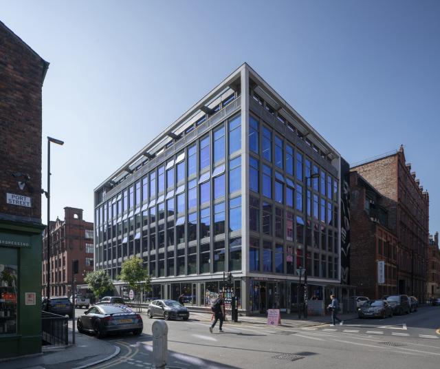
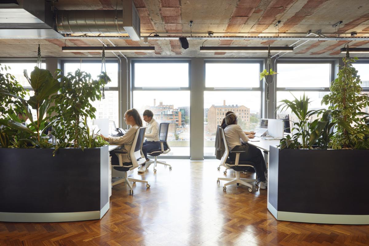
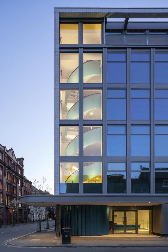
We felt that Seifert’s design preference would have been a full height window system and this has now been introduced. This change has transformed the building’s exterior giving it the well-proportioned simplicity it had originally lacked. The additional glazing brings more natural light into the floorplates and allows some impressive views out. The increased glazing also expresses the building’s original spiral staircase from the outside, becoming a compositional element with the canopy and entrance.
before and after gallery
A meanwhile use
Prior to works starting on site local artist Drew Forsyth was commissioned to use the building as a blank canvas. His response was the artwork 'Power', a collaboration between Drew and principal ballerina Bethany Kingsley-Garner of the Scottish Ballet. A series of 7 images were replicated that ran across the facades. A silhouette of Bethany that simulates rehearsal and strength.
"I think ballet has this perception of it being quite feminine and cute but it’s not really my experience of ballet. Ballet is tough and a determined art form, that’s what I wanted to represent.” Drew Forsyth
Describing the installation Drew said: "“It was like a 1970’s office block, it was horrible and abandoned. At one point we had to kick down a door to display some of the art – it had clearly been untouched since it had been built – it was pretty grim inside. The first 5 or 6 hours of the project was spent cleaning the inside of the windows, I don’t think they had been cleaned for years – 64 windows we cleaned but well worth it!”
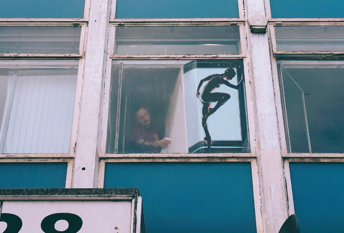
Image credits
© Gavin Stewart
Cert Properties
Drew Forsyth

Gavin Sorby
Gavin is managing director at Buttress with experience in various sectors across the practice, with a specific focus on commercial projects.

Shaadi Karimi
Shaadi is a creative architect with exceptional vision matched by commercial experience.